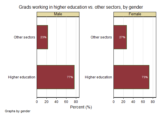
Our last data-related post looked at employment trends. Here, we break these down by gender. Our sample contains more women than men, so it’s not surprising that women outnumber men in all fields. The real question of interest is: what does the employment distribution look like within categories of gender? Because of the imbalance of men and women in our sample, the following analyses are stratified by gender – in other words, we look within gender categories to compare distributions.
In our gender-stratified analyses, we find that employment distributions are fairly similar between men and women, but there may be some slight imbalances. For example, 73% of sample women were employed in higher education (versus all other fields) at the time of data collection, compared to 77% of male grads. As a reminder, our higher education category includes full-time tenured/tenure-track professors, postdoctoral fellows, research fellows, administrators, and other contract positions.
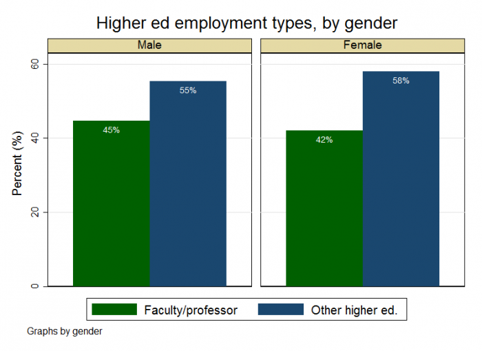
Because our higher education category is a composite variable and consists of various types of positions, it is also interesting to look specifically at faculty/professor employment versus other types of higher education occupations. We find that a higher percentage of men than women work in faculty/professor positions (45% vs. 42%, respectively). It should be noted that these differences, while interesting, are relatively minor from a statistical standpoint.
We’ll take a closer look at gender differences in non-higher education fields next time – stay tuned!
Our last data-related post looked at employment trends. Here, we break these down by gender. Our sample contains more women than men, so it’s not surprising that women outnumber men in all fields. The real question of interest is: what does the employment distribution look like within categories of gender? Because of the imbalance of men and women in our sample, the following analyses are stratified by gender – in other words, we look within gender categories to compare distributions.
In our gender-stratified analyses, we find that employment distributions are fairly similar between men and women, but there may be some slight imbalances. For example, 73% of sample women were employed in higher education (versus all other fields) at the time of data collection, compared to 77% of male grads. As a reminder, our higher education category includes full-time tenured/tenure-track professors, postdoctoral fellows, research fellows, administrators, and other contract positions.
Because our higher education category is a composite variable and consists of various types of positions, it is also interesting to look specifically at faculty/professor employment versus other types of higher education occupations. We find that a higher percentage of men than women work in faculty/professor positions (45% vs. 42%, respectively). It should be noted that these differences, while interesting, are relatively minor from a statistical standpoint.
We’ll take a closer look at gender differences in non-higher education fields next time – stay tuned!
Discussion
What does a graph of men/women in faculty/professor positions vs all non-ac/alt-ac jobs look like? I’d be interested to see how that breaks down, although I can imagine a bit from the slight difference in the second chart.
(I also think it would be really useful to have that chart to be able to show – some discussions on Twitter have asked this question! (of prof vs all non/alt ac, or even TT professor vs everything else!)
I also think it would be really useful to have that chart to be able to show – some discussions on Twitter have asked this question! (of prof vs all non/alt ac, or even TT professor vs everything else!)
Your intuition is correct – it’s pretty similar to what I show above. When we zoom out to the full sample and look at the data in this way, we find that faculty/professor employment (versus all other employment types) among men is 33%, compared to 30% among women. These proportions are statistically similar and I can’t make any conclusive statements about gender-related differences in faculty employment – although I wouldn’t be surprised if they exist.
As an aside, it’s important to remember that graph #2 above looks at employment trends specifically within our “higher education” category, hence the difference in proportions (for example, 45% of men working in higher ed. are employed as faculty, but this drops to 33% when we look at trends in the overall sample).